 |
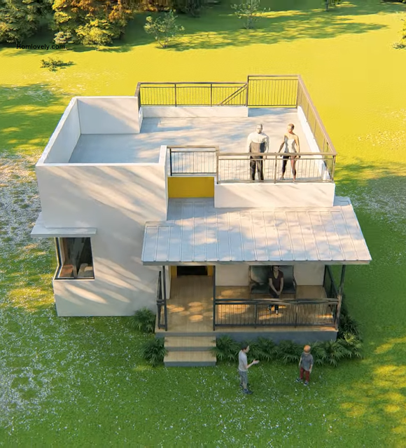
| 45 Sqm Box Type House Design with Roofdeck (Perfect Design for Growing House) |
Homlovely.com
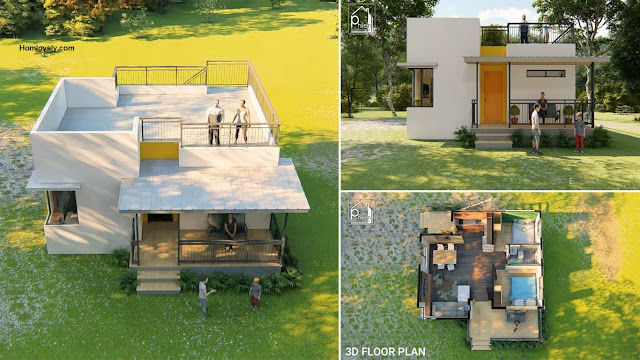
-- Box-type house designs are popular, with a simple appearance, this
house design is easier to build because it doesn't need to have many
complicated details. In addition, this box-type house model can also be
built as a growing house so that it can adjust the budget and needs you
have. The following is a house design idea with a box type measuring 45
sqm. Check out the details below.
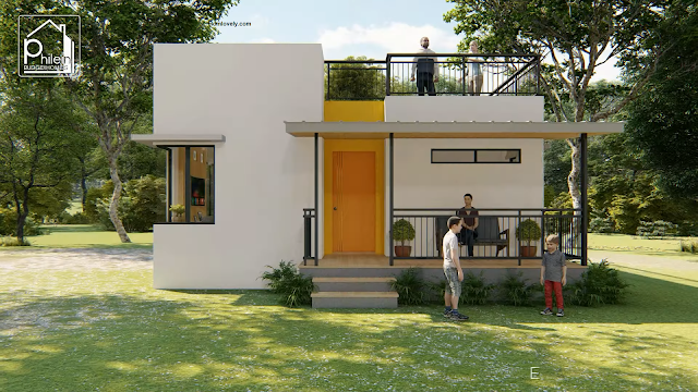
House facade design
Starting
from the facade design, this house appears with a very simple style
using the dominant white color so that it looks clean and has a neat
building structure. To provide interesting details, this house design
uses wood color in the front door area so that it looks fresher and not
monotonous.
Roof design
In
addition, this house design also has a very interesting detail, namely
the roof deck which is applied as a whole so that it can be used as a
spacious and comfortable functional space. To keep it safe, there are
also walls and raling with a size of 1 meter that surround the roof deck
perfectly. By using a strong roof deck design, the owner can also make
this house a 2-storey house in the future when they need additional
space with a more prepared budget.
Floor plan design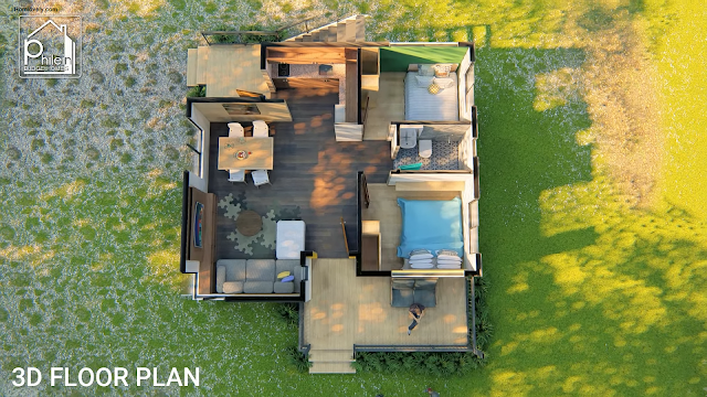
For
the floor plan design, this 45 sqm house has comfortable facilities for
the owner. There is a small porch that can be used as a relaxing area
by adding some chairs. Then for the interior area, there is a living
area, dining area, kitchen, bathroom, and also 2 bedrooms. See the floor
plan details in the picture above.
Living room design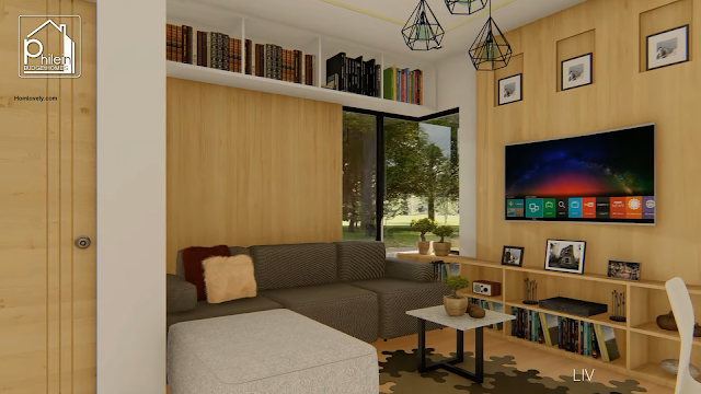
As
for the interior details, this is a view of the living room. This
living room occupies a cozy area with some very neatly arranged
furniture. The placement of the L-shaped sofa is able to bring a lot of
capacity but still space saving. For an interesting addition, this
living area also has a bookcase located at the top that still looks
neat.
Kitchen and dining area design
For
the next area, there is a dining and kitchen area that has a natural
look with typical wood colors and patterns. The kitchen set that has
matching details seems to be camouflaged on the wall and makes the room
look more spacious and neat. As for the dining area, it uses furniture
with a combination of white colors that make the room feel more
eye-catching and not monotonous.
Author : Hafidza
Editor : Munawaroh
Source : Philein Budget-Homes
Homlovely.com
is a home decor inspiration resource showcasing architecture,
landscaping, furniture design, interior styles, and DIY home improvement
methods.
Visit Homlovely.com everyday. Browse 1 million interior design photos, garden, plant, house plan, home decor, decorating ideas.

.png)


.png)


.jpg)
.png)

